Direct answer: The digital transformation J-curve is a fall in measured productivity after a new system or AI goes live. It then turns and rises past the original level. The fall happens because the team builds new processes, new skills, and new data. Reports rarely record these hours as output. Shorten the curve with 5 steps: 1 productivity measure, 1 first process, a training budget, a cut-over date, and a stop rule.
Main condition: this method applies to a company that replaces or adds 1 work system (accounting, CRM, point of sale, or an AI assistant) and can measure 1 team output per month. Without an output measure, the curve stays invisible; you can only feel it. Limit: the productivity J-curve research uses US economic data, and the AI assistant study below covers 5,179 US customer support agents. The 12-month index simulation here is dummy data, not survey data. Rama Digital is not a financial, legal, or tax adviser; this article explains the mechanism, not a promised result. A licensed legal and financial adviser must review every funding, valuation, and agreement decision. There is no promise of funding or results.
Sources were opened on 14 September 2026; each page shows its own update date. The example numbers in this article are a dummy-data simulation.
- General purpose technologies such as AI require complementary investments: new processes, products, business models, and human capital; these are often intangible and poorly measured (NBER WP 25148, revised January 2020; US data).
- Measured productivity is underestimated in a new technology's early years, then overestimated when the benefits are harvested (AEJ: Macroeconomics, January 2021).
- Intangible-adjusted US TFP was 11.3% above the official measure at end-2004, and 15.9% above at end-2017; the largest effect is in software (NBER 25148).
- A generative AI assistant raised the productivity of 5,179 customer support agents by 14% on average, and 34% for novice workers (NBER WP 31161, revised November 2023; US data).
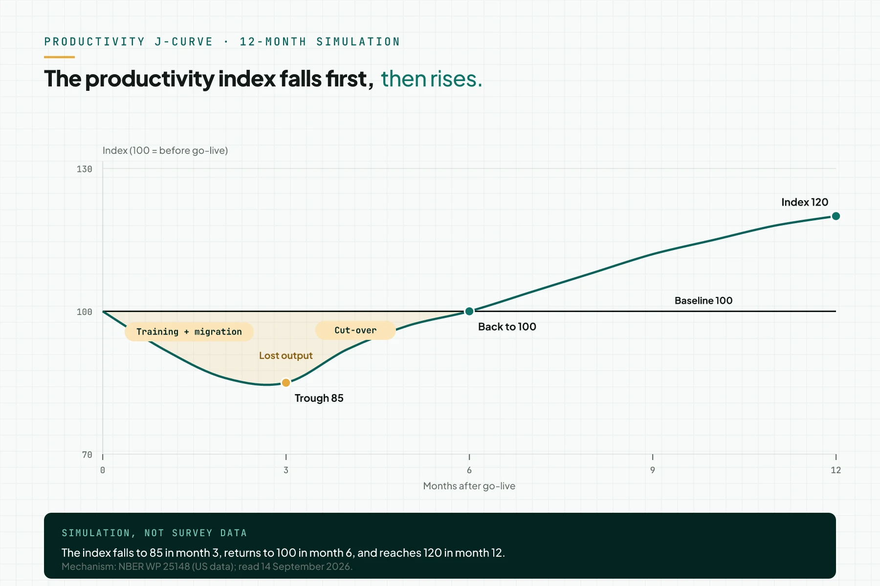
- Dummy index simulation: 100 before go-live, 85 in month 3, back to 100 in month 6, and 120 in month 12.
The digital transformation J-curve: measured productivity falls before it rises
Erik Brynjolfsson, Daniel Rock, and Chad Syverson explain this pattern with 1 model. General purpose technologies such as AI require complementary investments: new processes, new products, new business models, and new human capital (NBER Working Paper 25148). Their model yields a Productivity J-Curve: productivity slows first, then rises.
Measured productivity is underestimated in a new technology's early years. It is then overestimated once the intangible investment pays off (AEJ: Macroeconomics, January 2021).
The human side follows a similar pattern. In the Chaos stage of the Satir Change Model, group performance drops, and managers must plan for this stage (Steven M. Smith, 1997, a secondary source citing Weinberg).
In general, a J-curve shows a fall first, then a recovery past the starting point; read what the J-curve is for its 4 contexts. In this article, the Y axis is a measured productivity index, not cash or fund flow.
The problem: the first 3 months of decline are read as system failure
A 2017 paper lists 4 explanations for the AI productivity paradox. Implementation lags are judged the largest explanation (NBER Working Paper 24001).
Complementary investments are often intangible and poorly measured in national statistics (NBER 25148). The same pattern likely applies inside a company's monthly reports: hours spent on new processes, training, and data migration rarely count as output.
Misreading this dip carries risk. A team may revert to the old system or blame the vendor before the turning point.
Accounting software is a common first system that companies replace; read accounting software as the source of finance numbers (Indonesian source) for that system. Series A investors also read a company's systems and data before funding; read what Series A funding is for that angle.
Mechanism: 3 complementary investments that no report records
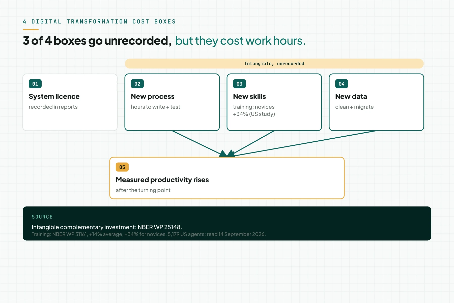
3 complementary investments set the depth and length of the J-curve. All 3 rarely appear in monthly reports, yet they cost work hours.
New process
A general purpose technology demands new processes, products, and business models (NBER 25148). Adjustment costs and organizational change can be modeled as intangible capital (NBER 24001).
New skills
The learning curve explains the skills side: a task needs less time and fewer resources the more often a team repeats it (Investopedia, Learning Curve). An 80% curve means efficiency rises 20% every time output volume doubles.
New data and business models
The largest J-curve effects appear in software, with smaller effects in computer hardware. The AI-related intangible effect on measured productivity is still small, but growing, as of the January 2020 revision. Intangible-adjusted US TFP was 11.3% above the official measure at end-2004, and 15.9% above at end-2017 (NBER 25148).
2 change models that explain the human side
2 change models explain the human side, not a financial J-curve.
The Satir Change Model holds 5 stages: Late Status Quo, Resistance, Chaos, Integration, and New Status Quo (Steven M. Smith, 1997). The Resistance stage starts when a foreign element demands a group response. In Chaos, performance drops, and managers must plan for it. In Integration, a transforming idea appears, and performance rises fast with practice. In the New Status Quo, performance settles higher than the Late Status Quo once well assimilated. This is a secondary page by Steven M. Smith citing Weinberg, not a Satir Institute citation.
Kubler-Ross introduced 5 stages in 1969, in the book On Death and Dying (EKR Foundation). Organizations adapted these stages as the Kubler-Ross Change Curve, a name that is a registered trademark of the Kubler-Ross family. Its responses run from Shock and Denial, Anger and Frustration, Bargaining and Reflection, Depression or Sadness, to Acceptance and Integration. The EKR Foundation states the stages are not rigid; the process is fluid and nonlinear.
Table 1 compares 3 models: a fall, then a rise. The last 2 describe a human response, not a financial J-curve.
| Model | What it measures | Stages | Trough | Trigger of the rise | Source and note |
|---|---|---|---|---|---|
| Productivity J-curve | measured productivity (TFP, output per hour) | complementary investment is built, then harvested | when intangible investment is largest and not yet paying off | new process, skills, and business model complete | NBER 25148 / AEJ Macro 2021; US data |
| Satir Change Model | group performance | Late Status Quo, Resistance, Chaos, Integration, New Status Quo | Chaos: performance drops | a transforming idea, plus practice | Steven M. Smith, 1997, citing Weinberg; secondary source |
| Kubler-Ross Change Curve | individual emotional response | Shock and Denial through Acceptance and Integration | Depression or Sadness | Acceptance and Integration | EKR Foundation; registered trademark; stages are nonlinear |
This article stays on the productivity index, not cash. Read the startup cash-flow J-curve: trough and turning point for the version with a rupiah axis. Read also J-curve vs hockey stick vs death valley curve to tell other curve shapes apart.
Prerequisites: 1 output measure, a 3-month baseline, 1 process owner
Prepare these 6 things before you start the steps to shorten the J-curve.
- 1 team output measure per month: orders processed, invoices issued, or tickets closed per work hour.
- A 3-month average before go-live as the baseline, written as an index of 100.
- 1 process owner who answers for this measure.
- 1 go-live date, already set.
- A training budget in work hours, not only the licence cost.
- 1 empty monthly index spreadsheet, ready to fill in.
Without a 3-month baseline, month 1's index has nothing to compare against. Start measuring before the system contract is signed.
Step 1: Set 1 productivity measure and a baseline of 100
Open the last 3 months of output reports. Choose 1 measure already recorded before the new system, then average those 3 months as a baseline of 100.
Use output per work hour, not the number of features used. Month n's index equals that month's output per hour, divided by the baseline, times 100. This fall-then-rise pattern follows the productivity J-curve (NBER 25148).
Evidence: a 3-month baseline usually gives an index of 90 to 110 in later months. A wider range means the measure is seasonal, and the team needs a 12-month baseline.
Step 2: Start with 1 process and 1 customer segment
Open the process list. Pick 1 process with high volume and clear rules, for 1 customer segment; read what an ICP is (Indonesian source) to choose that segment.
Rama Digital recommendation: build the complementary investment process by process, not all at once. Condition: 1 high-volume process with clear rules. 1 process keeps the dip shallower and shorter.
Evidence: 1 dated, 1-page process document, with the segment, input, output, and owner clearly written.
Step 3: Budget the complementary investments: training, process, data
Open the project budget. Add 3 new lines beyond the licence cost: training hours, hours to write the process, and hours to clean and migrate data.
A generative AI assistant raised the productivity of 5,179 US customer support agents by 14% on average, and 34% for novice workers (NBER Working Paper 31161). Train novice workers first, then senior workers.
An 80% curve means efficiency rises 20% every time output volume doubles (Investopedia, Learning Curve). Training volume, not course length, shortens the J-curve.
Evidence: 3 budget lines carry clear hour figures and an owner. Read ROI once: ROIROIProfit minus all costs, divided by all costs. ROI counts profit, while ROAS counts gross revenue.Open the glossary is calculated after the turning point, not in months 1 to 3.
Step 4: Limit parallel processes with a cut-over date
Open the project calendar. Write the date the old system stops for the chosen process; a parallel process doubles work hours without adding output.
The Chaos stage in the Satir model ends once a transforming idea appears and practice raises performance (Steven M. Smith, 1997). A cut-over date gives that stage a clear deadline.
Evidence: after the cut-over date, no new entries appear in the old system for that process. Build 1 exception report each week.
Step 5: Measure every month and set a stop rule
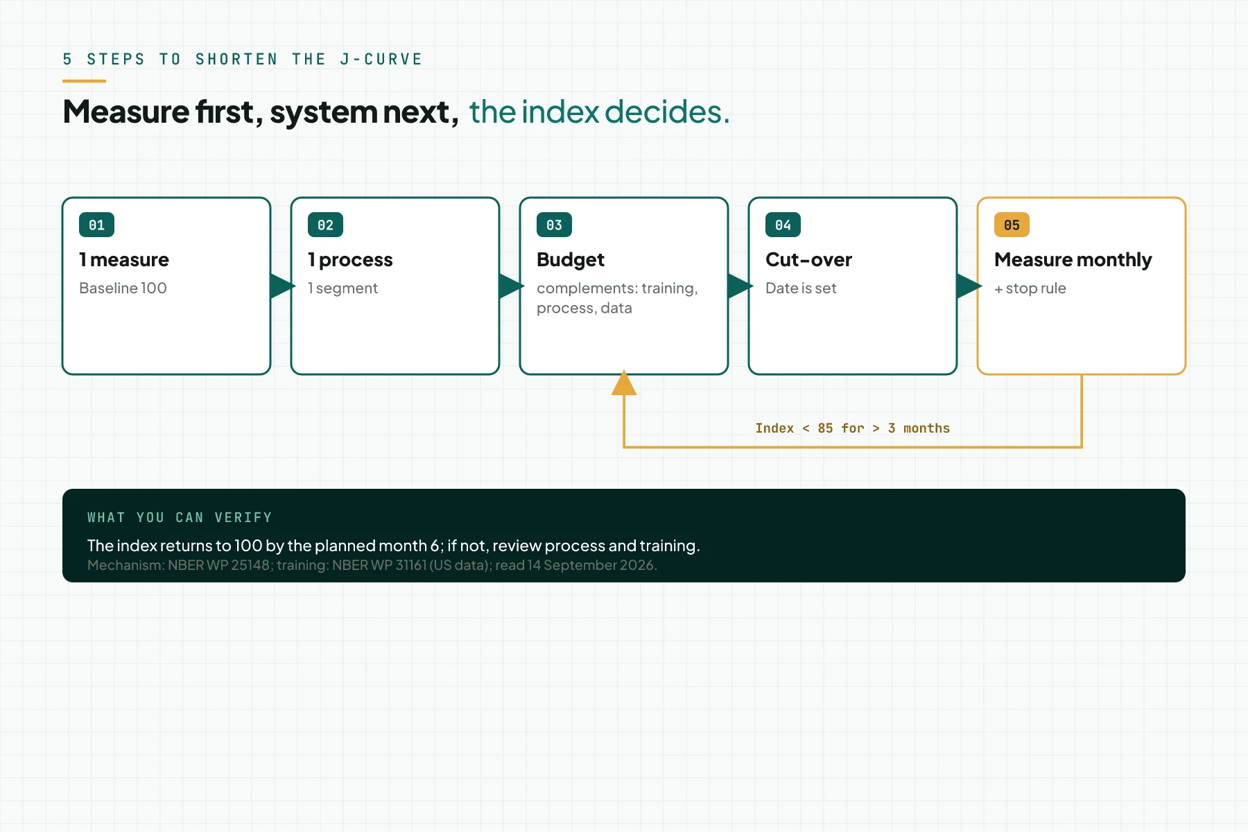
Open the index spreadsheet. Fill in the index for months 1 to 12. Compare it with the planned path: 85 in month 3, 100 in month 6, and 120 in month 12.
Stop rule: the index stays below 85 for more than 3 consecutive months, or it is not back to 100 by month 6. Either condition triggers a process and training review, not a cancellation. Rama Digital recommendation: review steps 3 and 4 before you change the system.
Report 3 numbers to the business owner every month: the trough, the month the index returns to 100, and this month's index.
Evidence: all 12 index cells are filled in with dates. Compare 1 dated chart with Figure 1 above.
Worked example: a 12-month productivity index after go-live (dummy data)
This simulation uses dummy data with a go-live date of 1 October 2026, built on 14 September 2026. It applies the step 1 index formula.
Months 1 to 3 carry training, data migration, and parallel processes. Cut-over starts early in month 4; routine practice runs months 4 to 12.
| Month | Index | Event |
|---|---|---|
| 0 | 100 | baseline (3-month average before go-live) |
| 1 | 92 | go-live; initial training; data migration |
| 2 | 86 | parallel process; continued training |
| 3 | 85 | trough; migration complete |
| 4 | 92 | cut-over; old system stops |
| 5 | 97 | routine practice |
| 6 | 100 | back to 100 |
| 7 | 104 | routine practice |
| 8 | 108 | second process added |
| 9 | 112 | routine practice |
| 10 | 115 | routine practice |
| 11 | 118 | routine practice |
| 12 | 120 | index 120; annual review |
The index trough of 85 lands in month 3. The index returns to 100 in month 6. It reaches 120 in month 12; these numbers are an index simulation, not survey data.
Checklist before a new system goes live
- Choose 1 output-per-hour measure, and set a baseline of 100 from the 3 months before go-live (process owner; evidence: 3 dated monthly numbers).
- Choose 1 process for 1 customer segment as the first process (business owner; evidence: a 1-page process document).
- Write an hours budget for training, process writing, and data cleaning outside the licence cost (project manager; evidence: 3 budget lines with owners).
- Schedule training for novice workers first, then senior workers (project manager; evidence: a training attendance list).
- Set the cut-over date when the old system stops for that process (business owner; evidence: a date on the project calendar).
- Fill in the monthly index, and compare it with the planned path of 85, 100, and 120 (process owner; evidence: an index spreadsheet and chart).
- Report 3 numbers to the business owner every month: the trough, the month back at 100, and this month's index (process owner; evidence: a 1-page report).
- Stop rule: when the index stays below 85 over 3 months, review process and training first, not the system.
Digital transformation J-curve FAQ
What is the digital transformation J-curve? The digital transformation J-curve is a fall in measured productivity after a new system, then a rise past the original level, per the Brynjolfsson-Rock-Syverson model. Its Y axis is a productivity index, not cash.
Why does productivity fall after a new system goes live? The team builds intangible investments: new processes, new skills, and new data. Hours spent rarely count as output.
How long does the productivity dip last? There is no single figure; US macro research measures it in years. This article's index simulation uses 3 months down and 6 months to recover; measure your own case monthly.
Does AI adoption follow a J-curve too? Yes. The same model applies to AI as a general purpose technology. A study of 5,179 US customer support agents recorded a 14% average gain, and 34% for novice workers.
How is the productivity J-curve different from the Kubler-Ross Change Curve? The productivity J-curve measures a company's measured output. The Kubler-Ross Change Curve describes an individual's emotional response, its name is a registered trademark, and its stages are nonlinear.
When should a new system be stopped? Not an automatic decision. Review the process and training first if the index stays below 85 for more than 3 months. Also review if it has not returned to 100 by month 6. This is a Rama Digital recommendation.
Next step
Rama Digital is not a financial, legal, or tax adviser, and this article does not promise a productivity gain for your business. If your team wants a written process order and training budget, use the AI Implementation Roadmap service. To ask a question first, book a 30-minute session.
Sources
- NBER Working Paper 25148: The Productivity J-Curve
- AEJ: Macroeconomics 13(1): The Productivity J-Curve
- NBER Working Paper 24001: AI and the Modern Productivity Paradox
- NBER Working Paper 31161: Generative AI at Work
- Investopedia: Learning Curve
- Steven M. Smith: The Satir Change Model (secondary)
- EKR Foundation: Kubler-Ross Change Curve