Direct answer: J-curve vs hockey stick: a J-curve falls below its starting point and then rises past it. A hockey stick stays flat for a long time, then rises sharply without ever falling. The death valley curve is the falling arm of the cash J-curve: the cash balance drops until revenue covers costs. An S-curve is slow, fast, then saturated. The 4 shapes use different axes, so the decisions differ: funding need, timing of added cost, fundraising date, and growth ceiling.
Main condition: this comparison applies to time charts (months or years on the X axis) used in business plans and pitch decks. Fix the Y axis first; only then does the shape carry meaning. Limit: the Groupon example and the death valley example are US data from Investopedia, not Indonesian data. The adoption S-curve cites a marked Wikipedia page because the primary source was not open. The 1-startup simulation uses dummy data. Rama Digital is not a financial, legal, or tax adviser. This article explains the mechanism, not the calculation. A licensed legal and financial adviser must review every funding, valuation, and agreement decision. There is no promise of funding or results.
We read the J-curve and hockey stick terms on Investopedia, 1 Wikipedia S-curve page, and Y Combinator guidance, on 14 September 2026. The example numbers in this article are a dummy-data simulation.
- A J-curve falls below its start, then rises past it (Investopedia j-curve-effect.asp, updated April 30, 2026). A hockey stick stays flat, then rises sharply, with a blade, a bend, and a shaft (Investopedia hockey-stick-chart.asp, updated March 02, 2026).
- Groupon (US data): sales under US$100,000 in 2008, US$14.5 million in 2009, US$312.9 million in 2010, and US$1.6 billion in 2011. It posted a US$413 million net loss in 2010.
- Death valley curve: the period a startup operates with no revenue. Investopedia example: US$5 million raised, 3 years, US$4.5 million in costs, US$125,000 needed within 4 months (Investopedia death-valley-curve.asp, updated June 30, 2022).
- S-curve: innovation adoption follows an S-curve over time; Rogers, Diffusion of Innovations, 1962 (Wikipedia, marked).
- Dummy simulation: a linear cash inflow rise of 20 million a month already turns the J-curve in month 19. No revenue hockey stick is needed to leave the trough.
J-curve vs hockey stick: different shape, different axis, different decision
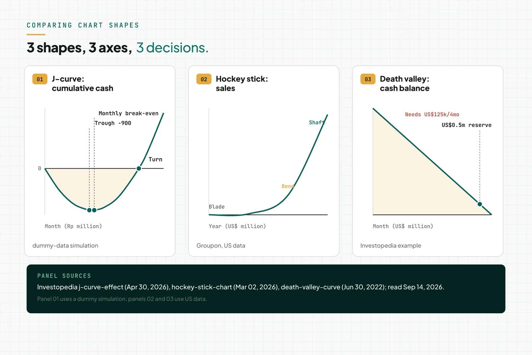
1 shape difference per curve, in short. A J-curve falls below its start, then passes it. A hockey stick stays flat, then rises without ever falling. An S-curve moves slow, fast, then saturated.
The axis sets the meaning of a curve. A J-curve usually uses a cumulative cash or return axis. A hockey stick usually uses a revenue or user axis. A death valley curve uses a cash-balance axis.
This section only compares shape. Read what the J-curve is for the full definition and its 4 contexts, since this article does not repeat them.
The problem: 1 chart is used to tell 2 different stories
A pitch deck often shows a revenue hockey stick, while the same company's cash follows a J-curve. Groupon reached US$1 billion in sales in about 2.5 years, yet posted a US$413 million net loss in 2010 (Investopedia, Hockey Stick Chart; US data).
A hockey stick projection often comes from top-down market sizing, not from real customer data. Read market sizing methods: top-down, bottom-up, and value theory (Indonesian source) for the difference between top-down and bottom-up.
A J-curve needs a trigger action and a plan for the rise. Without it, a falling line is only a loss, and a hockey stick with no real bend is only a flat line.
Picking the wrong chart sends 3 decisions off course. The funding amount, the timing of new cost, and investor trust in the next projection all drift.
Sharp growth usually comes from 1 niche that wins first, not from a line drawn on a slide. Read the wedge market: win a small niche first (Indonesian source) for that order.
The J-curve: below the start, then past it
A J-curve shows an initial decline, then a large recovery that passes the starting point (Investopedia, J Curve effect). Its trend line ends above the start, not back at 0.
The J-curve's Y axis is usually cumulative cash or fund returns, not revenue. It falls first because cash goes out faster than it comes in, then rises once inflow passes outflow.
2 numbers drive the decision from this shape: the trough's depth, and the time to the turning point. The dummy simulation in Figure 1 shows a trough of -Rp900 million in months 9-10, with a turning point in month 19.
The peak funding need equals the trough's absolute value, plus a reserve. That number often becomes the target for the next what Series A funding is round. The full monthly calculation lives in the startup cash-flow J-curve: trough and turning point.
A J-curve also appears in private funds and in digital transformation, each with its own axis. Read the digital transformation J-curve for the productivity-index axis.
The hockey stick: long flat, then a sharp bend
A hockey stick chart is a long period with no growth, then a sharp rise. Its parts are the blade (the flat part), the bend (the inflection), and the shaft, the long rising part (Investopedia, Hockey Stick Chart).
A hockey stick's Y axis is usually revenue, users, or sales, not cash. Groupon example (US data): sales under US$100,000 in 2008, US$14.5 million in 2009, US$312.9 million in 2010, and US$1.6 billion in 2011.
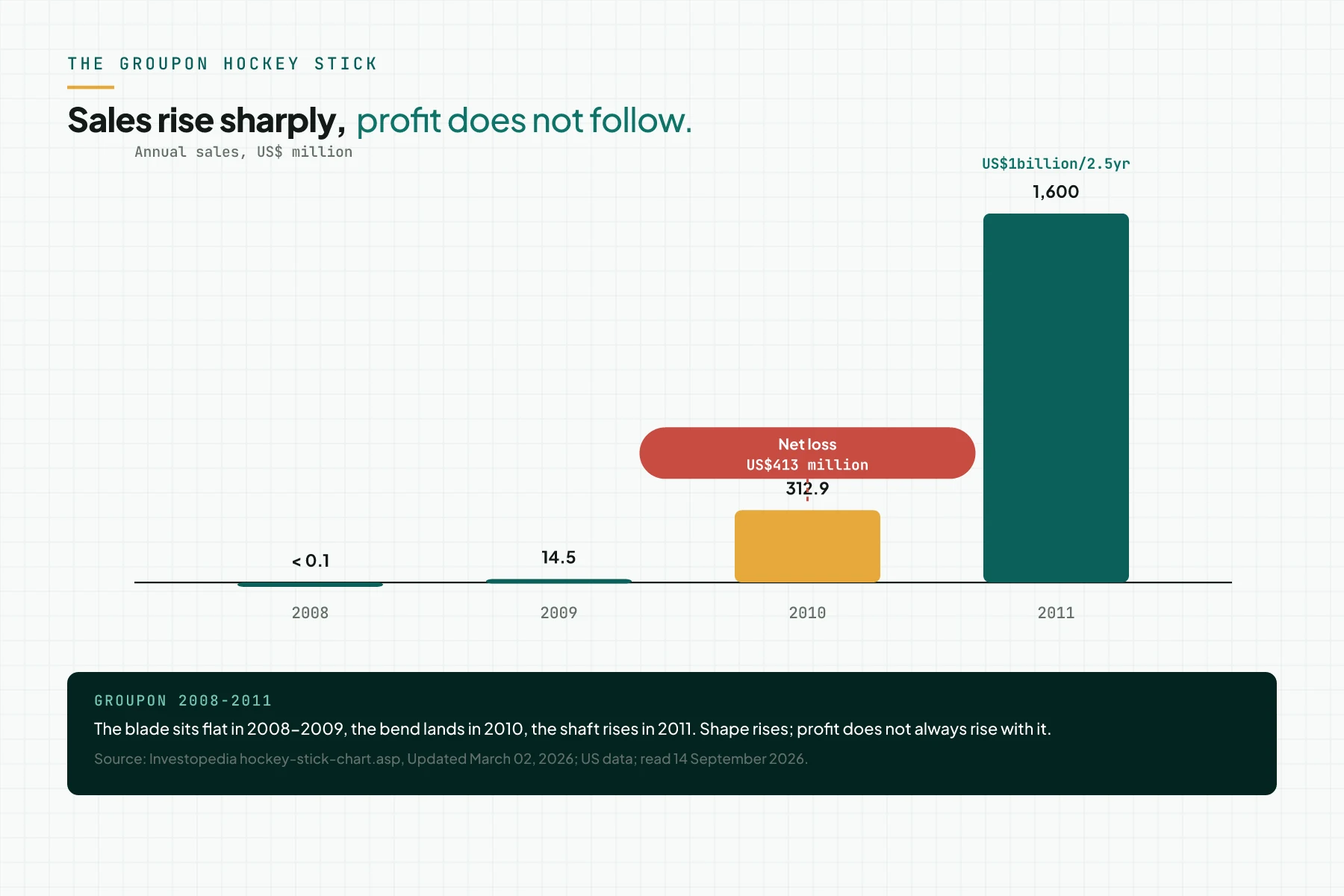
Groupon reached US$1 billion in sales in about 2.5 years, yet posted a US$413 million net loss in 2010. A revenue hockey stick does not show cost, cash, or margin.
A cash J-curve can run alongside a revenue hockey stick at 1 same company, as with Groupon. This is a conclusion from 1 example, not a general rule.
The decision that follows: add cost only after the bend shows up in historical data, not in a projection. Unit economics must still cover the cost to serve before that bend arrives.
The death valley curve: cash falls until the first revenue
The death valley curve is the period when a startup already operates, but has not yet earned revenue (Investopedia, Death Valley Curve). VCs use the term because the shape of the cash-burn chart looks like a valley.
During this period, a startup spends the initial equity capital from its shareholders. The longer the death valley curve, the higher the chance of an early failure.
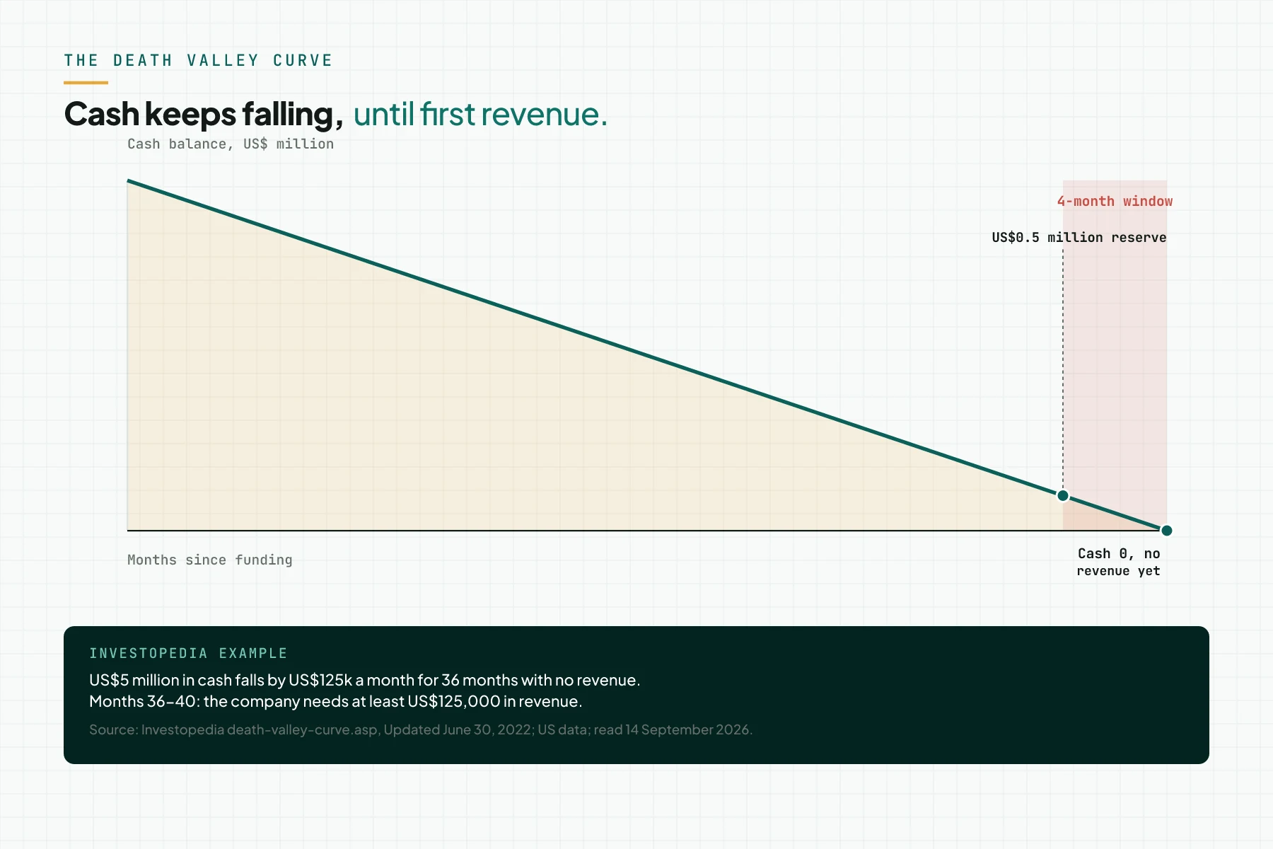
Investopedia example (US data): US$5 million raised, 3 years with no revenue, US$4.5 million in costs (20 staff x US$70,000 in salary, plus US$300,000 in admin), with a US$500,000 reserve. The company needs at least US$125,000 in revenue within 4 months after year 3.
The death valley curve is the cash J-curve seen from the risk side: cash falls until revenue covers costs. A J-curve also covers the recovery; the decision that follows a death valley curve is the fundraising start date.
Y Combinator advises starting to raise with about 8 months of runway left (Y Combinator, How Much Should You Spend After Fundraising?). YC calls less than 2 months of cash the point of no return (Y Combinator, Advice for companies with less than 1 year of runway).
The S-curve: slow, fast, then saturated
Everett Rogers published Diffusion of Innovations in 1962. He showed that adoption of an innovation follows an S-curve over time: slow at first, fast in the middle, then saturated (Wikipedia, Diffusion of innovations, marked because the primary source was not open). Rogers splits adopters into 5 categories: innovators, early adopters, early majority, late majority, and laggards, with no official percentage we can confirm today.
The early part of an S-curve looks like a hockey stick, before growth saturates. The decision that follows an S-curve is the growth ceiling for 1 segment, and when to move to the next one. That is the same idea as winning a small niche first.
Comparison table: 4 shapes and the decisions that follow
Table 1 summarises the Y axis, the start and end, the number to read, and the decision that follows each shape. The US example numbers come from Investopedia; the S-curve comes from a marked Wikipedia page.
| Shape | Usual Y axis | Start | End | Number to read | Decision that follows | Source |
|---|---|---|---|---|---|---|
| J-curve | cumulative cash, fund returns, productivity index | falls below the start | rises past the start | trough depth; turning-point month | funding need = absolute trough value + reserve | Investopedia (US/global data) |
| Hockey stick | revenue, users, sales | long flat (blade) | rises sharply (shaft) | whether the bend has happened in historical data | add cost after the bend, not before | Investopedia, Groupon (US data) |
| Death valley curve | cash balance | falls from day 1 | stops once revenue covers cost | the month cash falls below 2 months of cost (point of no return, YC) | fundraising start date, at about 8 months of runway (YC advice) | Investopedia (US data); Y Combinator (US/global data) |
| S-curve | cumulative adoption | slow | saturated | position on the curve: early, mid, or saturated | when to move to the next segment | Wikipedia (marked; US/global data) |
Rama Digital recommendation: use the cumulative cash J-curve to set the funding amount. Use the revenue hockey stick only with historical data, not a projection. Use the cash-balance death valley curve to set the fundraising start date. All 3 hold only when read from 1 same set of books.
1-sentence note: currency appreciation forms a reverse J-curve, the mirror image of the J-curve (Investopedia, J Curve). This shape is not 1 of the 4 rows in the table.
Worked example: 1 startup, 3 charts from the same data
Dummy simulation: starting cash of Rp1,200 million, and a steady gross burn of Rp200 million a month. The net cash inflow in month n equals 20 million times n. Month 1 starts in October 2026.
Table 2 shows 3 chart columns from the same set of books: net cash inflow (the revenue line), cumulative cash flow (the J-curve), and cash balance (the death valley view).
| Month | Net cash inflow, Rp million (revenue line) | Cumulative cash flow, Rp million (J-curve) | Cash balance, Rp million (death valley) |
|---|---|---|---|
| 1 | 20 | -180 | 1,020 |
| 6 | 120 | -780 | 420 |
| 9 | 180 | -900 | 300 |
| 10 | 200 | -900 | 300 |
| 12 | 240 | -840 | 360 |
| 19 | 380 | 0 | 1,200 |
| 24 | 480 | 1,200 | 2,400 |
The revenue line rises in a straight line, from 20 million in month 1 to 480 million in month 24. It never forms a hockey stick. The J-curve still turns in month 19, matching the Figure 1 simulation.
The lowest cash balance is Rp300 million, in months 9 and 10. A straight-line rise that passes gross burn already turns the J-curve, with no revenue hockey stick needed (dummy simulation).
Checklist before you use 1 chart in a pitch deck or plan
Use this checklist before you place 1 chart in a pitch deck or business plan. The last item is the stop criterion.
- Write the Y axis and its unit in the title of every chart, before you draw the shape (owner: founder; evidence: a chart title with a unit).
- Separate the revenue chart from the cash chart; never merge them on 1 axis (owner: finance; evidence: 2 charts from 1 set of books).
- Mark the historical and projected parts with different colours and a dated boundary (owner: founder; evidence: a dated boundary line).
- For a hockey stick, show the bend in at least 4-6 months of historical data, not only in a projection (owner: founder; evidence: a monthly table in the appendix).
- For a J-curve, write the trough depth and the turning-point month as numbers on the chart (owner: finance; evidence: 2 number labels).
- For a death valley curve, write the month cash falls below 2 months of cost, and the fundraising start date (owner: founder; evidence: a calendar date).
- Stop criterion: remove a chart from the deck when its Y axis cannot be explained in 1 sentence. Remove it also when its numbers cannot be traced to the books.
J-curve, hockey stick, and death valley curve FAQ
What is the difference between a J-curve and a hockey stick? A J-curve falls below its start, then passes it. A hockey stick stays flat, then rises sharply and never falls. The Y axis differs too: a J-curve usually tracks cash, a hockey stick usually tracks revenue.
Is the death valley curve the same as the J-curve? Not exactly. The death valley curve is the falling arm of the cash J-curve, seen from the risk side. A J-curve also covers the recovery after the trough.
What is hockey stick growth? Hockey stick growth is a long flat period, then a sharp rise, with a blade, a bend, and a shaft. Groupon rose from US$14.5 million to US$1.6 billion in 2 years.
Does a hockey stick mean the company is profitable? Not always. Groupon posted a US$413 million net loss in 2010, even as its sales rose sharply. A revenue hockey stick does not show cost or cash.
What is an S-curve in business? An S-curve shows adoption that starts slow, speeds up, then saturates. Rogers published the concept in 1962 (Wikipedia, marked). The decision that follows is when to move to the next segment.
Which chart sets the amount to raise? Use the cumulative cash J-curve. The peak funding need equals the trough plus a reserve. A revenue hockey stick does not answer this question.
Next step
Limit: Rama Digital is not a financial, legal, or tax adviser. This article explains chart shapes and the decisions that follow, not how to build a pitch deck or funding advice. If your team wants to map its own cash and revenue numbers before drawing a chart, use the AI Diagnostic service. The session maps bottlenecks and a first step, including which numbers are not yet tracked, not a pitch deck. To ask a question first, book a 30-minute session.
Sources
- Investopedia: J Curve effect
- Investopedia: Hockey Stick Chart
- Wikipedia: Diffusion of innovations (marked)
- Investopedia: J Curve (jcurve.asp)
- Investopedia: Death Valley Curve
- Y Combinator: How Much Should You Spend After Fundraising?
- Y Combinator: Advice for companies with less than 1 year of runway